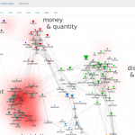
Mapping election night voices
Hashtag cooccurrence network of tweets about Trump (collected thanks to Twitter search API and using the simple query “trump”) during the election night.
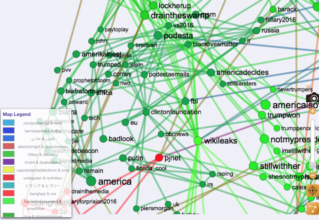
Hashtag map based on almost 2 millions tweets published during the Election Night (approximately between 3 and 4 am Eastern Time). The network is made of the main connected component of the 1000 most popular hashtags during that time range. [The json/twitter parsing capacities of CorText were used to import the data straight from Twitter search API]
A second map shows hashtags that have been converted from their original casings into lower-cased featuring. Colored sets of hashtags
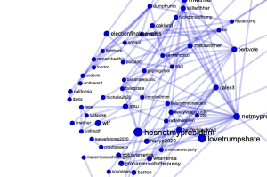
Close-up on the #bananarepublic & #notmypresident group of related hashtags
illustrate the various kinds of concerns raised by Twitter users coming from all over the world (many clusters are also specific to a language (German, Portuguese, etc.)) as Donald Trump was winning the election. As an illustration “#bananarepublic & #notmypresident” cluster is shown left.
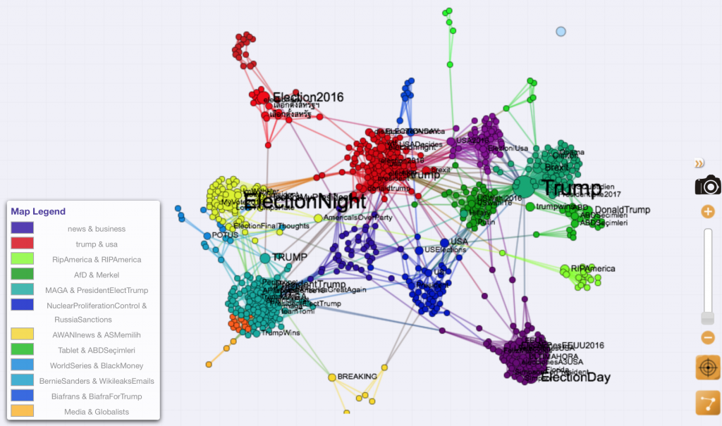
Conversely another hashtag network was produced using tweets collected during the exact same time period and mentioning “hillary”, “clinton” or “hrc”. Only 350 000 tweets were found giving shape to the map below.
Hashtag cooccurrence network in tweets mentioning Hillary Clinton. Only the main connected component is shown. Two hashtags are co-occurring if mentioned by the same user. Network settings are exactly the same than Trump network
Dynamical patterns of hashtags occurrences over one hour can be unveiled using Distant Reading script. Follow this link to compare the temporal profile of the set of 1000 most frequent hashtags in both Trump and Clinton corpus (for a total of 1333 entities). The time series are originally computed using the Trump corpus:
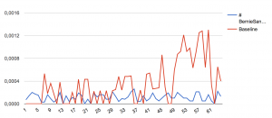
Proportion of tweets mentioning the hashtag #BernieSanders in the Trump (blue) and Clinton tweet corpus (red)
starting from the 1st to the 64th minute (3.11 am to 4.14 am ET). But they are also compared to the dynamical profiles of the same hashtags as measured on the Clinton corpus (using frequency background option when starting distant reading script) as illustrated in the screenshot below:
French Republican primary:
The same analysis has been produced to map the right primaries in France. 303 428 tweets were published during the week preceding the first tour of the elections (12 novembre 2016 – 21 novembre 2017).
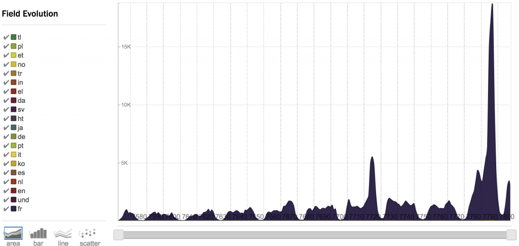
10 days of tweets, mostly in French, notice the daily pattern and the highest peak during election day, and the small peak for the last debate of the primary
The associated hashtag map shows the main topics of concern of Twitter users during the campaign:
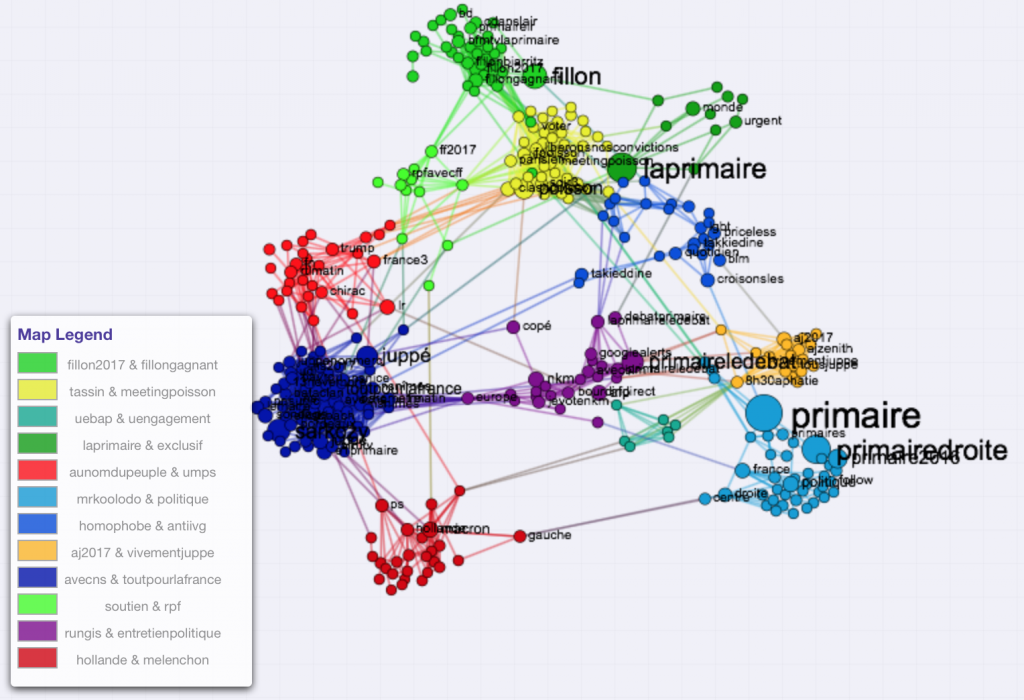
Hashtag map – “primaire de la droite”, 500 most popular hashtags (lower case)
More interestingly, it is also possible to map Twitter user map, linking two users when they share the same hashtags. Of course proximity between accounts is then reduced to the presence of a few hashtags that does not necessarily equate with a political agreement, but it already gives an idea of the strong difference in the topics discussed in each political family. Indeed, it seems that very clearly-cut communities organized around each candidate naturally emerge from this analysis. Reading the name (or even observing emojis) allows to learn a lot about the composition of each group.
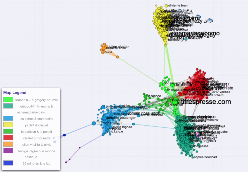
Twitter user network (600 most active accounts – metrics=cosine_het)
But looking more closely at hashtags preferentially used by each community of user it is even clearer that when the central blue community seem to be animated by political commentators and large news media, the other clusters are mostly aggregated around candidates. Nathalie Kosciusko-Morizet appears in the quite small and isolated orange cluster. Sarkozy had very strong online supporters online, appearing in the lower green cluster when Fillon camp is clearly
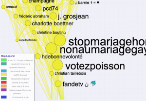
Close-up of the top cluster where supporters of Jean-Frédéric Poisson are found, note the importance of accounts opposed to the gay wedding
standing out in a very dense cluster. Juppé supporters show right in the center of the map, but they are definitely less active than other candidates’. Poisson, backed by numerous Twitter users standing for #mariagepourtous movement is clearly in a peripheral position, suggesting most of his campaign themes were not shared with his opponents.
On a more methodological note, the video below illustrates other possible options for analyzing Twitter datasets using CorText platform: